Jetpack Compose vs SwiftUI
In this article, I will share with you the similarities and differences of Jetpack Compose and SwiftUI. We’ll look at how to handle concurrency and state management with Compose and SwiftUI. Please checkout these Github repositories Images Compose App and Images SwiftUI App on sample apps to follow along.
What are the benefits of looking into SwiftUI and Compose?
Thinking about architecture and approaching a certain problem is different in both platforms. You maybe working together with an iOS developer on a feature. Understanding the basics of the platform the other person is using helps to build a bridge and facilitate better collaboration. In this article, we’ll look at how to build an app on both platforms and compare the approaches. Some things are easier on one platform than the other.
Building an iOS and Android App
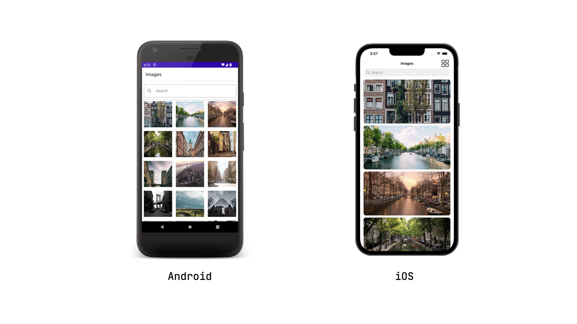
Assume we wanted to build an Android and iOS which had the following features.
Features
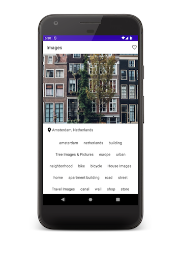
-
Display a list of images either in a grid or list. The user could switch between a grid or list view.
-
The user could search the collection of images.
-
Clicking on an image will take the user to the details screen. The details screen will show an image’s location and tags.
-
An image could be liked and unliked.
Jetpack Compose
In order to create this screen this screen, we’ll setup a composable function that interacts with a view model.
Defining State
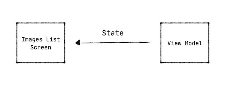
The view model will expose a stream of ui states to the composable function. These are the possible ui states we could have.
sealed class ImagesUiState {


    object Loading: ImagesUiState()

    data class Success(
       val images: List<ImageData>
    ): ImagesUiState()

    data class Error(
      val errorMessage: String
    ): ImagesUiState()
}
In our composable function, we’ll declare different UI elements for each state. The view model will contains a MutableStateFlow with a default value of the loading state.
val uiState = MutableStateFlow(ImageUiState.Loading)
As the view model loads, we’ll launch a coroutine to get all the images. The UI state follow is updated with a list of the images to display.
class ImagesViewModel {

    init {
       viewModelScope.launch {
          try {
            val images = repository.getImages()
            uiState.value = ImagesUiState.Success(images = images)
          } catch {
             uiState.value = ImageUiState.Error(message = R.string.error_message)
          }
      }
  }
}
Collecting State
We have a view model that is exposing a stream of data. How we do we read this stream of data to declare what should be displayed? The stream of data can be modeled in different ways. A MutableStateFlow, LiveData or an Observable could be used. The compose framework provides
utilities to read a stream modeled with any of these constructs.
Stream of Data
- LiveData -> observeAsState
- Flow -> collectAsState
- Observable -> subscribeAsState
We’ll use the collectAsState method to build a state object in Compose.
@Composable
fun ImagesListScreen() {

    val uiState = uiState.collectAsState().value

    when (uiState) {
        ImagesUiState.Loading -> { ... }
        ImagesUiState.Success -> { ... }
        ImagesUiState.Error -> { ... }
    }
)
The composable method above reads the UI state and should specify what is declared based on the different ui states.
Declaring Loading State
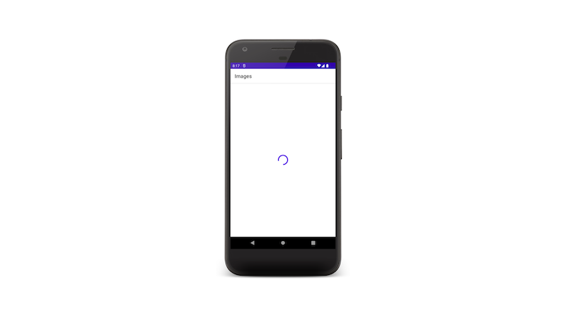
@Composable
fun ImagesListScreen() {

    val uiState = uiState.collectAsState().value

    when (uiState) {
        ImagesUiState.Loading -> {
              Column(
                  modifier = Modifier.fillMaxSize(),
                  verticalArrangement = Arrangement.Center,
                  horizontalAlignment = Alignment.CenterHorizontally
              ) {
                    CircularProgressIndicator()
              }
        }
    }
)
To display a progress bar, I have specified a column that aligned to the center of the page.
It contains a CircularProgressIndicator.
Declaring Success State
The UI has two views aligned vertically - the search bar and the grid of images. We could arrange these views into a column
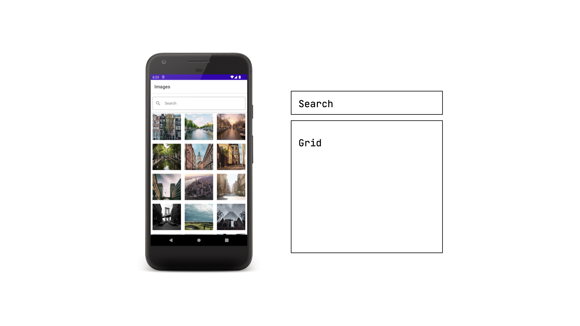
ImagesUiState.Success -> {
    Column {
      SearchView { }
      LazyVerticalGrid() { }
    }
}
The compose framework provides a lazy vertical grid where you could specify the number of columns to displays.
LazyVerticalGrid(
     cells = GridCells.Fixed(3)
) {
    items(uiState.images) {
        Image(
           painter = rememberImagePainter(it.url),
           modifier = Modifier
                      .size(128.dp)
                      .padding(8.dp)
                      .contentScale = ContentScale.Crop
       )
}
I’m using the coil library above to display images. The library is similar to Picasso and Glide. However, it is fully implemented using coroutines. The library has Jetpack Compose integration.
Search State
Using an OutlinedTextField in the compose library, we could build a search view. The view will need to handle remembering the query as the user is typing and interact with a view model to perform the search.
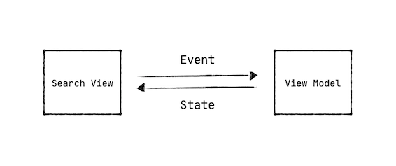
val queryState = remember { mutableStateOf("") }

OutlinedTextField(
    value = queryState.value,
    onValueChange = {
         queryState.value = it
    }
)
The OutlinedTextField view contains different parameters to intercept the keyboard actions and to specify the query to display. Every time the user types something, onValueChange is invoked. I’m updating the query state in it. The query state value is fed back into the view to display. If the view value wasn’t constantly updated, the text won’t change in the search view.
@Composable
fun SearchView(
    onSearch: (String) -> Unit
) {
        OutlinedTextField(
            keyboardActions = KeyboardActions(
            onDone = {
               onSearch(queryState.value)
            }
          )
        )
}
Column {
   SearchView {
        imagesViewModel.searchImages(query)
   }
}
The search view propagates the onSearch event. You may also directly pass in a view model to performs the search. The use of callbacks collides with a reactive approach. Based on your school of thought, you may choose either approach to setup events.
class ImagesViewModel()

     fun searchImages(query: String) {
          viewModelScope.launch {
              uiState.value = ImagesUiState.Loading
              val images = repo.searchImages(query = query)
              uiState.value = ImagesUiState.Success(images = images)
          }
     }
}
Side Effects

As the user clicks on an image in the grid, the person will be taken to the details view. On this page, we want to get the image’s details based on id. Compose has a launch side effect that will help us to accomplish this.
@Composable
fun ImageDetailsScreen(imageId: Int?) {

    LaunchedEffect(key1 = imageId) {
        viewModel.getImage(imageId)
    }

    val uiState = uiState.collectAsState().value

    when (uiState) {
        ImageDetailsUiState.Loading -> { ...  }
        ImageDetailsUiState.Success -> { ...  }
        ImageDetailsUiState.Error -> { ... }
    }
}
When the details view is launched, the side effect will make a request to get the details. The result is pushed to a ui state. The composable will render the correct view based on the ui state.
Eager State Updates
Another feature in the details page is the ability to favorite an image. When the favorite icon is clicked upon, a request is made. But, for a good user experience, we want to eagerly update the icon. How do we handle this compose?
Scaffold(
    topBar = {
        TopAppBar(
             title = {
                Text(text = "Images")
             }
    },
    content = {

    },
    actions = {
       Icon(
         Icons.Default.FavoriteBorder
       )
    }
)
Compose provides you with the ability to scaffold your app with a top bar and content underneath. You could setup navigation to update the content and keep the same top bar. However, another approach you could take is to have separate top bars for each screen. This may cause flashing in the top bar due to transition animations.
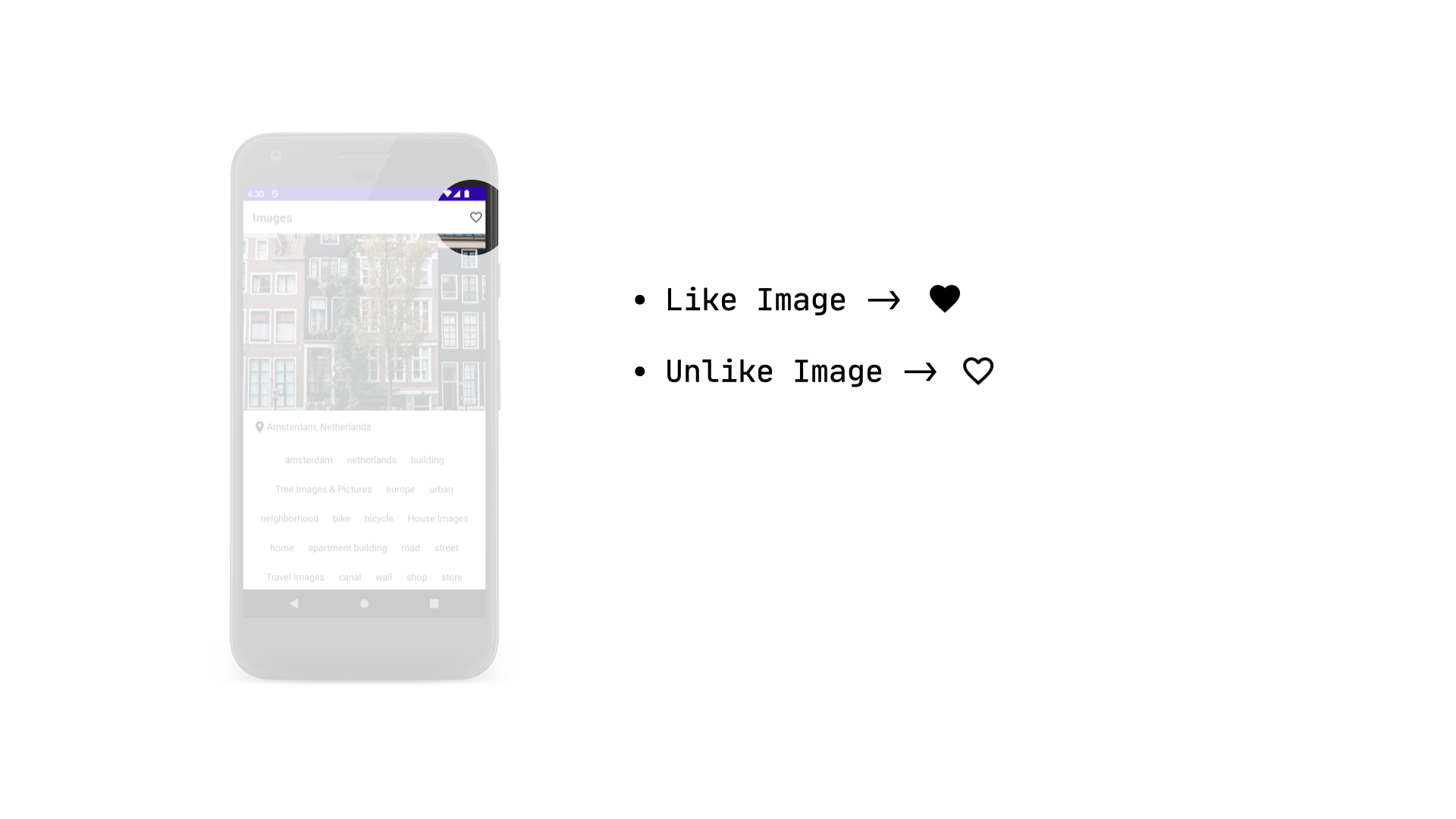
The view model for the details page will specify a like state. Its default value will be false.
class ImageDetailsViewModel {

      var isLiked = mutableStateOf(false)

      fun likeImage(imageId: Int) {

            isLiked.value = true

            viewModelScope.launch {
                val result = repo.likeImage(imageId)
                result.onFailure {
                    isLiked.value = false
                }
          }
      }
}
Before making the actual request to like an image, the state of isLiked is updated eagerly to toggle the icon state. Only during a failure, the like state is reset to false. You may implement debouncing or cancelling an ongoing like request.
val isLikeState = remember { viewModel.isLiked }

Icon(
    if (isLikeState.value.not())
          Icons.Default.FavoriteBorder
    else
          Icons.Filled.Favorite
)
SwiftUI
We looked at how build our sample app in Compose. We used different features in Compose such as MutableStateOf, remember {} and side effects. How do we go about approach the same problem with SwiftUI? The same problem has to be approach with a different. You cannot carry over the same methodology. Certain things will easier to do with SwiftUI while others not straight forward. I will highlight as explore how to build this app in SwiftUI.
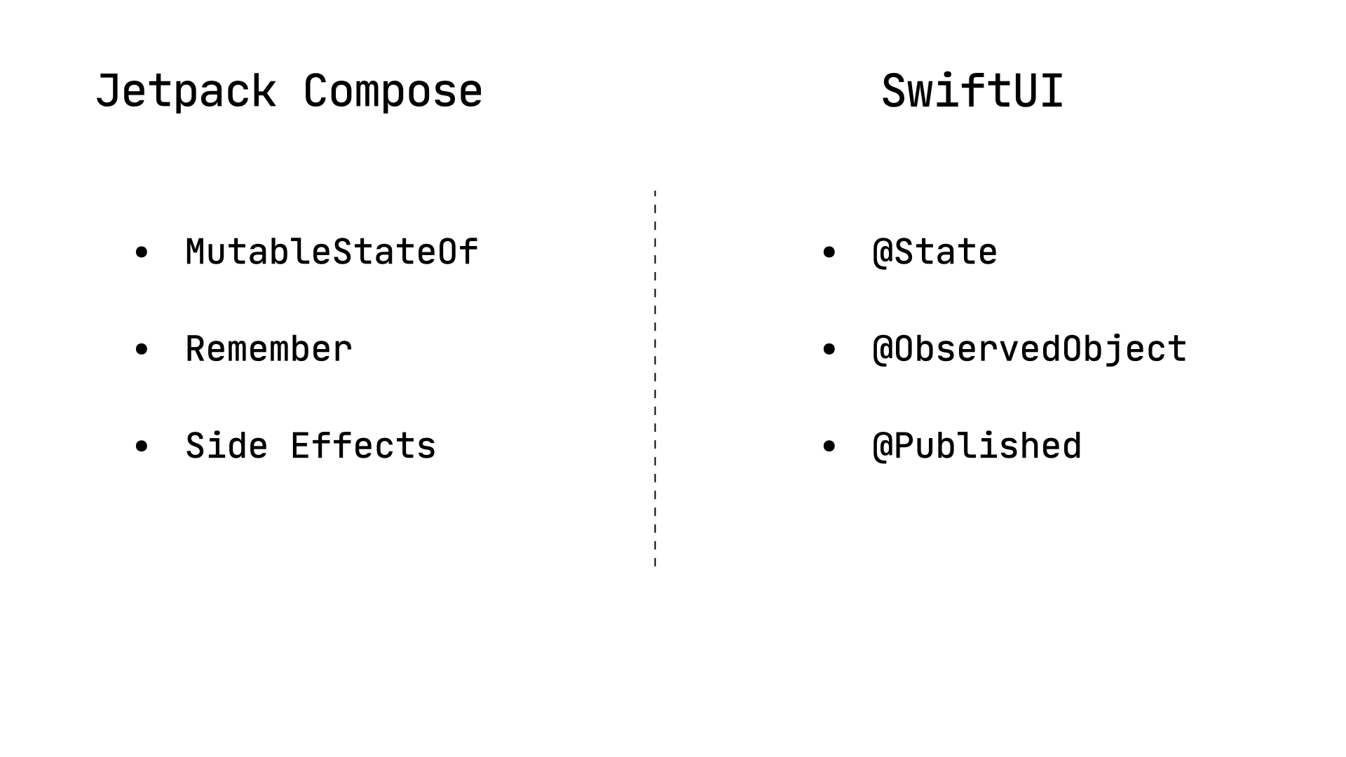
SwiftUI provides us with annotations such as @State, @StateObject, @ObservedState and Published to specify state.
Observed Object
We need to create a repository that loads images. One approach to take in Swift is to create an Observed Object. The object will contain a list of images. Anytime the list is updated it will send informs all observers such as a view.
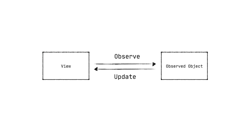
class ImagesRepository: ObservableObject {

     @Published var images: [ImageData] = []

}
The Published annotation specifies that any changes to the images list will notify observers.
Async & Await
Swift 5.5 introduced a concurrency framework using async and await and tasks. The repository will have an async method to get images. The async method is similar to a suspending method in coroutines.
func getImages() async {
     images = apiService.getImages()
}
The code snippet above will give the following error - Publishing changes from background threads is not allowed; make sure to publish values from the main thread. Any changes to object that is marked as Published needs to be done on the main thread. To resolve this error, the method or class can be marked as MainActor.
@MainActor
func getImages() async {
     images = apiService.getImages()
}
In Kotlin, a Result type could be used to model a success or error result of an async code. However, with Swift, a common practice is to return the data from the async method.
State Object
How do we use the repository in a view?
struct ContentView: View {

     @StateObject var repository = ImagesRepository()

}
Anytime you want to instantiate an observed object use a StateObject. It’s not good practice to not use annotated as State.
Tasks
The getImages method is marked as an async method. In order to call this method, we need to make a Task object. Task can be launched in the background and cancelled. SwiftUI provides us with task method on the view. After the view is created, it will launch a task where any background work can be done.
struct ContentView: View {


     @StateObject var repository = ImagesRepository()


}.task {

      await repository.getImages()

}
The framework will handle cancelling a task when the view is detached. However, the auto cancellation behavior is only support when you launch a task in the task method. Otherwise, you will have to handle cancellation yourself.
Creating and launching a task is similar to launching coroutines. However, a scope is not required for creating a task. A task can have priorities. It can be launched detached to any particular object.
State
As the task is running to get images, we want to display a progress bar. We can introduce state which is a simple boolean to toggle showing the progress bar.
struct ContentView: View {


     @State var showProgressBar = true


}
Since the progress bar will be in the middle and top of other views, we could use a ZStack in the SwiftUI framework.
ZStack {
    if (showProgressBar) {
            ProgressView()
               .progressViewStyle(
                     CircularProgressViewStyle(tint: .blue)
               )
    }
}
We’re checking the state and declaring the progress view to shown if it is set to true.
struct ContentView: View {


     @State var showProgressBar = true


}.task {

      await repository.getImages()
      showProgressBar = false

}
After the images are returned we set the showProgressBar state. We could wrap the getImages call in a try and catch and set the state to show a progress bar.
A view model doesn’t have to be created for each screen in SwiftUI. It is an approach that can be taken. But, the simplest approach is to specify the state in the view.
To display a list of grid of images, we could use a LazyVGrid.
LazyVGrid(spacing: 10) {
    ForEach(repo.images, id: \.id) { item in
           Image(item.url)
                 .resizable()
                 .frame(minWidth: 0, maxWidth: .infinity)
    }
}
In compose, we would specify the modifiers as an argument to a composable function. However, in SwiftUI, the modifiers are specified by calling different methods on a view. In the example above, we are specifying the Image is resizable and it has a frame with a specific size.
Two State Binding

Implementing the search feature with SwiftUI is very different. SwiftUI has the ability to provide a two binding for a state which we will for the search feature.
@State var searchText = ""

LazyVGrid(spacing: 10) {
   ...
}.searchable($searchText)
We want to place the search view above the lazy vertical grid. SwiftUI provides a searchable function for the view which will create and position the search view for us. We have created search text state and provided it to the searchable function. Every time the user types a query the state will be updated.
@State var searchText = “"

var searchResults: [ImageData] {
      if searchText.isEmpty {
          return repository.images
      } else {
          return filterImages(searchText)
      }
Based on state of the search query, we’ll query the repository for filtered images.
Eager State Updates

As we did with Compose, how do we handle the state of the like button? This is another example of how different state handling is in SwiftUI compared to Compose.
struct ImageDetailsView: View {

    let imageData: ImageData

}
The view above represents the image details view that has data to display. The ImageData object is passed from the images list.
struct ImageDetailsView: View {

    @State var isLiked: Bool = false

    let imageData: ImageData

}
The view also specifies a isLiked state for the like icon in the top bar. As state is appears on the screen, we need to update the state. SwiftUI provides an onAppear method on a view. We’ll set the liked state in it.
struct ImageDetailsView: View {


    @State var isLiked: Bool = false

    let imageData: ImageData


     var body: some View {

         ...


     }.onAppear {
          isLiked = imageData.isLiked
     }

}
When the like button is clicked upon, we’ll toggle the state of isLiked. Swift provides a toggle method on booleans to change the truth value.
Button(action: {
     isLiked.toggle()
}) {
     Image(systemName:  isLiked ? "heart.fill" : "heart")
}
As soon the state is toggled, we want to make a request to like the image. SwiftUI provides a onChange method on a view to observe changes to a particular state.
struct ImageDetailsView: View {

    @State var isLiked: Bool = false


     var body: some View {

         ...


     }.onChange(of: isLiked) {

     }
}
We’ll need to launch a Task to call an async method to like the image.
@State var likeTask: Task<Void, Never>? = nil

struct ImageDetailsView: View {

    @State var isLiked: Bool = false


     var body: some View {

         ...


     }.onChange(of: isLiked) {
          if (newValue) {
              likeTask?.cancel()
              likeTask = Task {
                  await repository.likeImage(id: imageData.id)
              }
          }
     }
}
We’re cancelling the previous task and creating a new task to like the image. This is the approach we could take to handle updating the like button state. It’s a different approach with Compose as shown earlier.
Conclusion
We looked at how to build a simple app with both Jetpack Compose and SwiftUI. The approaches for using these frameworks is different as outlined above. There are some similarities. Please checkout these Github repositories Images Compose App and Images SwiftUI App.

